
Noah S. Berger
Studio Six Guest Author
\\
Maps and Legends:
A Transit Professional Raised on Vignelli’s Vision
Guest author Noah Berger, is the Deputy Administrator at Cape Cod Regional Transit Authority and a former director at the Federal Transit Administration.
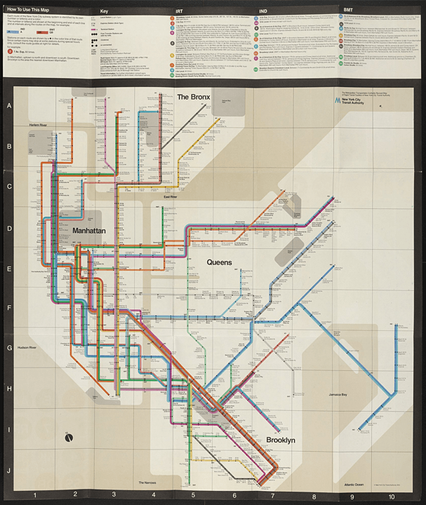
Massimo Vignelli,
Unimark International Corporation, New York, NY
New York City Subway Guide, 1970–1972
Lithograph, 28 x 23”
On display in the Museum of Modern Art
Source: https://moma.org
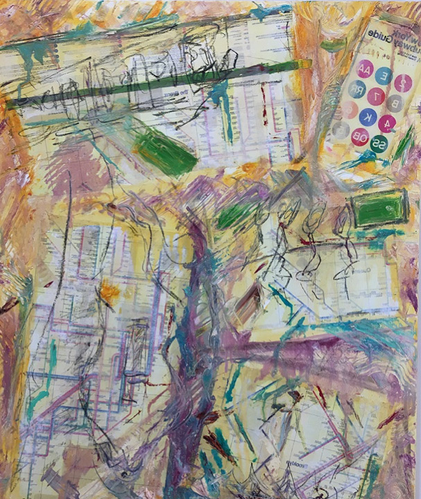
Homage to Vignelli,
Oil, Acrylic & Map Transfer on Canvas, 2017, 30 x 24” Painting by author, previously displayed at New Art Center Freedman Healthcare Gallery, Newton, MA
Source: Author’s private collection
I grew up in New York City in the 1970s and fell in love with the iconic Massimo Vignelli subway map before I knew it was iconic (or even knew what iconic meant). I was unaware that it was the work of a divaesque Italian designer or that the map was transformative in how it represented my city. I didn’t appreciate that other cities didn’t have such lush or robust transit networks, and didn’t have transit maps that doubled as works of art. I didn’t know that the original lithograph of the map would later be exhibited in the Museum of Modern Art. I just knew that this map called to me and pulled me in.
I had no inkling future generations would view this era in New York’s history as one characterized by chaos, near-bankruptcy, blight, looting, Son of Sam, or the disturbingly-named Charlie Chop-off. I only knew that I could take a joyride on the open-air spaces between the sloped ends of the futuristic-looking R-40 subway cars, feeling the rush of air roaring through the subway tunnel, long before anybody coined the term “safety first” or transit police would arrest people for riding between cars. I walked the abandoned freight tracks above the old Meatpacking District when it was just bums and drug dealers, before anybody envisioned the current beloved High Line Park.
To me, Vignelli’s subway map captured all of this beautiful chaos and gave it order—an order that still shapes how I put the city together in my mind today. Somewhat synesthetically, I associate numbers and letters with the colors of the routes on the map: M will always be sky blue; R is dark green; 1 is pumpkin orange; 4 is magenta; 7 is peach. I could argue the washed-out browns and grays that represented the rivers and parks were actually realistic depictions of the grass and water of New York in the 70s. The reality is that, for me, it worked stylistically. It’s not that Vignelli was faithless to New York’s distinctive geography. Rather, he captured the essence of the city’s shape and shoreline with sweeping stylized gestures, like Matisse capturing a still life or a figure with a few well-chosen lines.
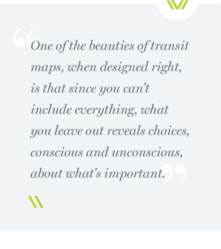
One of the beauties of transit maps, when designed right, is that since you can’t include everything, what you leave out reveals choices, conscious and unconscious, about what’s important. Vignelli’s map kept the focus on lines and stations—how they connected, intertwined. Each line was branded as an individual while connected to the whole as part of a clear set. Stations, the portals to the system, were captured in such beautiful simplicity with the bold point of a black dot—one for each line stopping at every station. And, better than any map before or since, it represented speed—the dynamism of New York’s unique system of Local and Express trains. The placement of the black circles showed that although the 1, 2, and 3 trains all ran together under Broadway and 7th Avenue, only the 1, which was my train, stopped at all the local stations and the 2 and 3 only stopped at the express stations. With this elegant simplicity, the map artfully facilitated transfers based on speed as well as geometry.
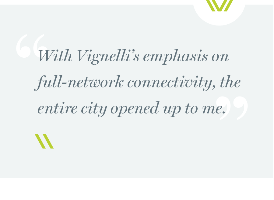
With Vignelli’s emphasis on full-network connectivity, the entire city opened up to me. Through personal challenges and tragedies—my diagnosis of type 1 diabetes at six (back when it was still called juvenile diabetes), my mom’s fight with breast cancer when I was eleven, or her death from leukemia when I was sixteen—the subway was my refuge and I navigated it according to the subway map I knew by heart. Guided by Vignelli, I took the subway everywhere, without limits. New York City of the 70s was oddly segregated. There were neighborhoods that white kids were told they should not and could not go. My mom never went back to Anderson Avenue in the South Bronx, the street where she and my uncle grew up when the neighborhood was called the West Bronx, because she said it wasn’t safe. But, for me, at least, none of those restrictions applied to the subway. It was all connected, as clearly visualized in the map I internalized. And I went everywhere on it, from the South Bronx to Bed-Stuy and everywhere in-between. Thanks to Vignelli’s map, New York was not a hodgepodge of isolated lines or neighborhoods—it was a full, interconnected system life-force.
Although I didn’t realize it at the time, the map made me proud to be a New Yorker. The city was depicted through the eyes of an immigrant, weaving what is foreign, mysterious, unknown into something with logical simplicity and clarity. Vignelli infused the map with the love and reverence that immigrants bring to their adopted homes—that is quintessentially New York. The map had its own flavor and became the face of the New York City Transit Authority.
Yes, it was a work of art worthy of its future MoMA exhibition. But not a prissily pristine one. It was an interactive companion and I would draw on it, make notes, scribble doodles, and even add new subway lines and extensions I thought should be built. Today, transit authorities too often cede their system map to Google Maps, giving up control of how their system is represented. In so doing, they lose both the prioritization of what is important and the artistry to uniquely capture a system’s flavor and color.
And, it was free. As a kid, I recall my excitement as I approached the token booths of blessed memory and requested a complimentary subway map. I was especially excited if it was a new edition; disappointed if the token clerk told me he was all out. I confess that on the day in 1979 when the clerk handed me an entirely different-looking map, I was eager to pore through it. This map was completely different. Gone were the individual line colors and straight lines. Gone was the geographic minimalism, replaced with a more representative geography, more directly connected to the streets above.
The new map was designed by committee under the leadership of John Tauranac, whose biggest graphological accomplishment to that point was creating a map of Lower Manhattan that identified the exact location of all public bathrooms—a most utilitarian product. But the literal representation of the new map came at a cost. Lost was the clear depiction of how the lines and stations connected into a system, the color, the beautiful symmetry, the artistry. I quickly came to miss the Vignelli map—the map I had grown up with. Later, long after it was no longer the official map, I still used it to navigate the system – to take me to Yankee Stadium where I worked as a vendor or to the Miller Concerts on the Pier where I worked concessions for the mob.
Now, almost four decades and two hundred and fifty miles removed from my formative years in New York, I have built a career as a public transportation professional. And, self-indulgently, at least according to my wife, I also like to think of myself as an artist. Both are rooted in Vignelli’s map.